


What does your particular system look like?
Have you ever been pulled in to a software project and had to figure out how everything works? Often, your options are limited to either sifting through piles of documentation or diving into thousands of lines of code. Unfortunately, the documentation probably became obsolete as the software grew and evolved and, while the code is accurate by definition, it requires a lot of concentration to trace through and figure out how everything fits together.
Ideally, what we really want is a method that reflects the accuracy of the code but is more accessible and easier to understand. The best strategy for large software systems to achieve this is to create a kind of living documentation. The idea with living documentation is to generate it from the existing codebase. This way, the documentation is accurate and can be easily kept up-to-date – just regenerate it as needed (for example, as part of an automated build).
🔗Visualizing NServiceBus Systems
In an NServiceBus system, endpoints can be developed, maintained, and run as independent processes that exchange messages with each other. Creating new ways for these endpoints to communicate can be as simple as creating a new message type. This level of loose coupling comes at a cost, though. It can be difficult to get a high-level picture of the endpoints that make up a system and the messages that flow between them.
One approach could be to analyze your codebase to see how messages flow through your system. But in order for any tool to do this, it would need to examine the code to see when and where messages are sent and where they are handled. This is not trivial, and the problems are compounded if the messages and endpoints are spread across more than one solution.
In an earlier blog post, we mentioned a new visualization technique that we’ve been working on to show how messages flow through a system. By extracting the endpoints, message types, and message-exchange patterns of your system from the runtime stream of audited messages, we are able to provide a higher level and up-to-date visualization, true to the principles of living documentation.
🔗What does it look like?
This graph, generated from one of our samples, gives you a sense of the kind of documentation that can be generated automatically, showing the endpoints and the flow of messages between them.
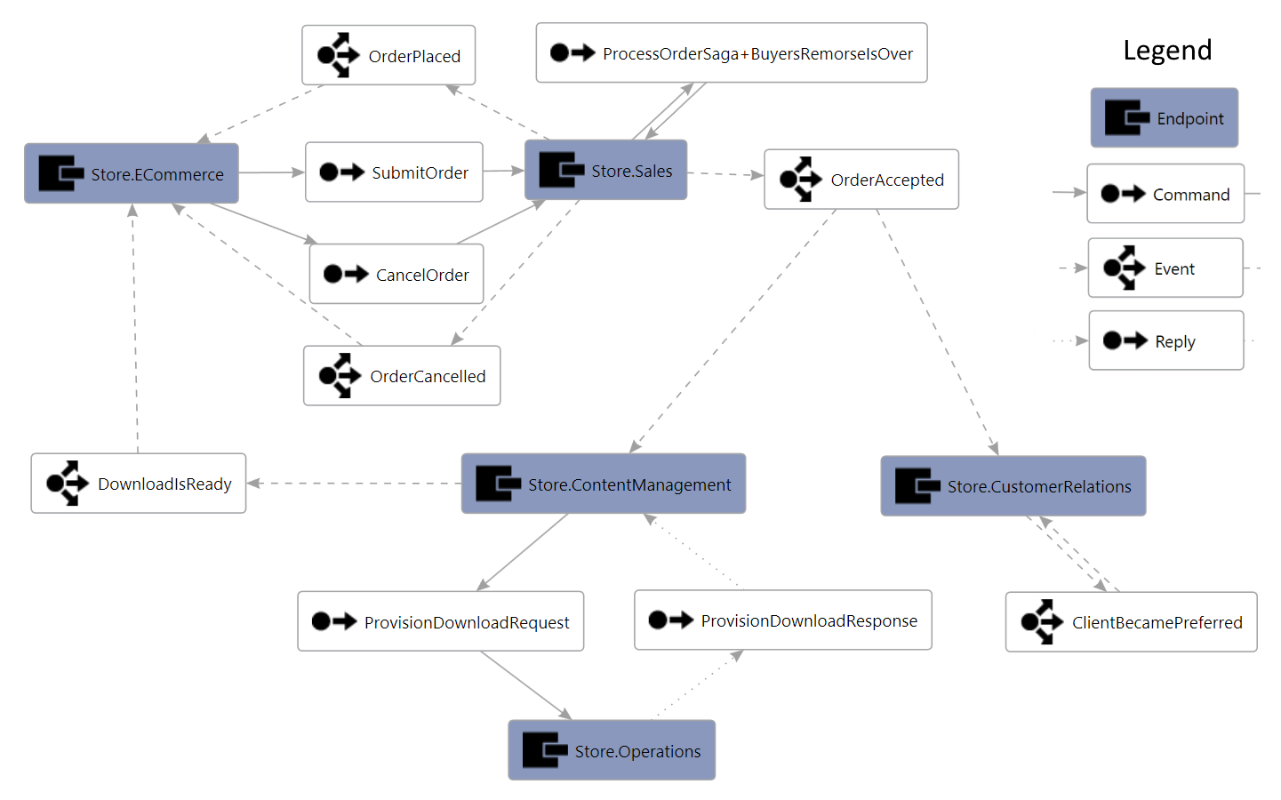
Also, the graph isn’t just an image – it’s a kind of XML file1 that Visual Studio can render, allowing you to alter the layout and formatting however you like.
🔗How does it work?
When an NServiceBus endpoint with auditing enabled processes a message, it will forward that message to an audit queue, along with some metadata about how it was processed. Then ServiceControl reads all of these messages and stores them in an embedded database.
The new visualization tool aggregates data from all of the messages in the ServiceControl database, extracting the message types as well as the endpoints responsible for processing them. From this information, the tool constructs a directed graph showing the flow of messages between endpoints.
🔗In closing
Imagine having high-level documentation of how your system works that’s always up to date. No more arguments among developers saying, “No, that’s how it used to work. Now things are different.” New developers could get up to speed much faster.
So go ahead, download the visualization tool and try it. Oh, and don’t forget to tell us what you think – we’d really appreciate your input.
🔗Footnotes
1 Directed Graph Markup Language (DGML)
About the author: Mike Minutillo is a developer at Particular Software with a passion for generating living documentation, mostly so he doesn’t have to spend time writing it by hand.
 Share on Twitter