What's new in ServiceInsight 2.2

A common problem with most distributed systems is that it’s hard to get a good view of how all the disconnected pieces work together—unless you’re using ServiceInsight. From the audit records of successfully processed messages, ServiceInsight shows how messages are related and gives you visualizations so you can better understand how one message results in another, and how the different parts of the system communicate.
ServiceInsight 2.2 is out now, with plenty of improvements. This release adds new insights (pun intended) to your distributed systems.
🔗More message metadata
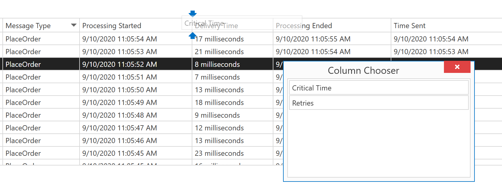
In the last few releases we’ve gradually added more message metadata to ServiceInsight including Correlation ID, Critical Time, Delivery Time, Processing Ended, and Processing Started. In this release we’ve continued that trend and added Retries. This is the number of times a message has been retried, regardless of whether it has yet been successfully processed.
To keep the UI uncluttered, all this new metadata is hidden by default. To show it, right click the Messages window to open the Column Chooser:

🔗More insights
We’ve made it even easier to understand the behavior of your distributed system and to detect potential problems. Look out for the yellow warnings!
🔗Clock drift
Clock drift is when the clocks on the machines running your endpoints are not synchronized. If the clocks have drifted significantly, you may end up seeing a message which was processed before it was sent! This results in negative Delivery Time, and usually in negative Critical Time. In these cases, yellow warning icons are shown:

You can avoid this for future messages by synchronizing the clocks on all the machines running your endpoints, using a technology such as NTP.
🔗Successful retries
In previous versions of ServiceInsight, when retries were required to successfully process specific messages, those messages were displayed with standard green success icons. In this release, those icons have a warning overlay:

Together with the new Retries metadata, you can now see which messages required retries before they were successfully processed, and how many retries were required. If you spot repeated patterns of these transient failures, it may be an opportunity to avoid them and optimize the performance of your system.
This does not apply to messages which were edited and retried in ServicePulse. Those messages are effectively new messages, and not retries of the original messages.
🔗Sequence diagram
The sequence diagram shows a timeline of all messages in a conversation and how they were processed. This helps you understand the sequence of operations which led to specific outcome, which is often a challenge with a distributed system.
Endpoints are often scaled out, which means a single logical endpoint may consist of multiple physical endpoints. For example, two machines may each be running an instance of the same physical endpoint and consuming messages from the same queue in a competing-consumer pattern. These two physical endpoints act as a single logical endpoint.
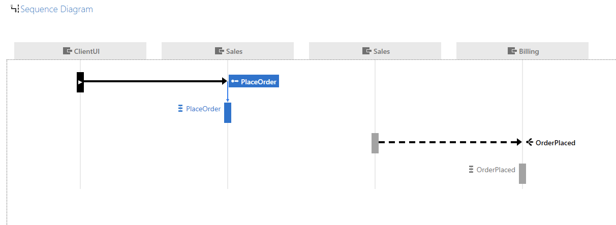
In previous versions of ServiceInsight, each physical endpoint was shown separately:

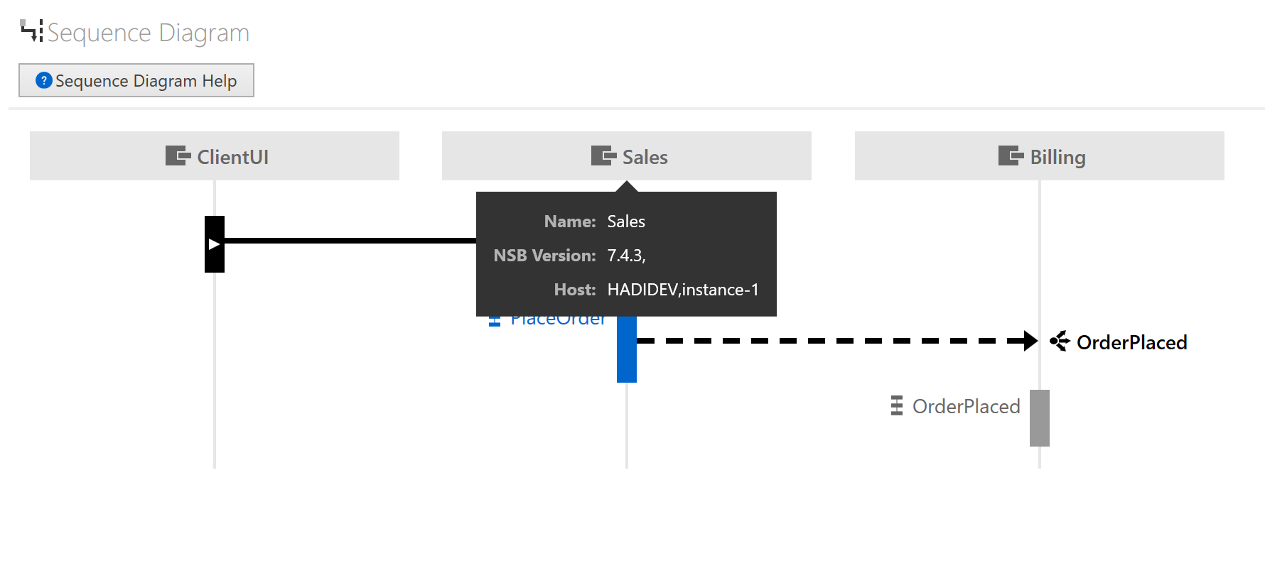
In the screenshot above, notice how two physical Sales endpoints are shown, even though there is only one logical Sales endpoint. In a high-level view like the sequence diagram, this level of detail is usually not required, and the disconnected nature of the diagram may even lead to confusion. In this release, only the logical endpoints are shown. If you still need to know which physical endpoint handled a message, that is shown as a tooltip:

Note that a ServiceInsight sequence diagram is slightly different from a standard UML sequence diagram, so we’ve added the Sequence Diagram Help button to explain the differences.
🔗But wait… there’s more!
The list of improvements goes on…
When you click Open in ServiceInsight in ServicePulse, you will switch to an existing ServiceInsight instead of always launching a new one. The existing ServiceInsight will simply switch to the same instance of ServiceControl that ServicePulse is connected to.
We’ve also made some tweaks and enhancements to the Saga view.
And the cherry on top: we’ve switched to vector graphics, to ensure ServiceInsight looks crisp and beautiful on high-DPI monitors.
🔗Summary
ServiceInsight 2.2 introduces a number of improvements that help ensure 20/20 vision of your system.
If you like what we’ve done, or want to suggest other improvements, we’d love to hear more. Just click the Feedback button in ServiceInsight and drop us a line:

Our release announcement contains the full list of the changes in this release.
As always, you can install the latest version of ServiceInsight from our website.


 Share on Twitter
